2026
Innova Suite
A Uruguay-based NetSuite consultancy turning ERP complexity into operational clarity for multiple businesses around the globe.
Institutional Website
Tech and Software
The Challenge
Innovasuite's expertise was undeniable, but their website didn't project it.
An outdated and non-responsive website was quietly undermining the trust the brand needed to win clients.
It wasn't just a matter of aesthetics: the design felt years behind: long walls of text, little visual communication, and nothing guiding the eye toward what mattered.
The copy had the same problem from a different angle. It spoke at length about Innovasuite's services, but rarely about the people those services exist for — their ICP. Visitors could read the entire site and still not see their own problem described anywhere on it.
And underneath both, the architecture. Pages were organized in a way that made sense internally, not to a first-time visitor. The site had no clear path, and no clear point.
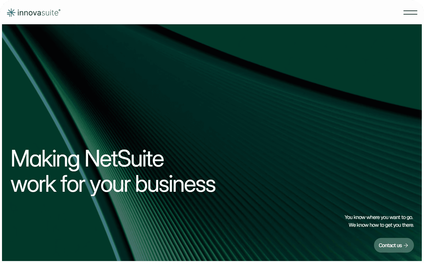
The challenge, then, went beyond redesigning a website. It meant rebuilding the structure, the message, and the visual language around one idea, stated as clearly as possible: "We make NetSuite work for your business".
The Approach
The rebuild the entire experience, from architecture, through the copy to the front-end design of the website.
In projects like this, it's tempting to jump straight to the visual design. It's the most visible problem, and it's the part everyone wants to see fixed. We didn't start there.
A beautiful site organized around the wrong logic is still the wrong site. We rebuilt the sitemap around their ICP's questions, in the order they actually ask them, and cut every section that didn't help answer one nor bring any institutional value.
The copy came next, and it came before any visual design — the visuals exist to give the words form, not the other way around. The clearest example is the "Sounds Familiar" section: a collection of the questions Innovasuite actually hears from clients every day. A visitor scrolling through it finds their own situation described back to them, sometimes word for word. That recognition does more convincing than any list of services could.
To finnish, a new Visual Design to support the new message, built on hierarchy and space, and responsive from the first sketch to all the most common devices.
Every one of those decisions serves the same sentence: "We make NetSuite work for your business."
More Works
©2026
FAQ
01
What does a project look like?
02
How is the pricing structure?
03
Are all projects fixed scope?
04
What is the ROI?
05
How do we measure success?
2026
Innova Suite
A Uruguay-based NetSuite consultancy turning ERP complexity into operational clarity for multiple businesses around the globe.
Institutional Website
Tech and Software
The Challenge
Innovasuite's expertise was undeniable, but their website didn't project it.
An outdated and non-responsive website was quietly undermining the trust the brand needed to win clients.
It wasn't just a matter of aesthetics: the design felt years behind: long walls of text, little visual communication, and nothing guiding the eye toward what mattered.
The copy had the same problem from a different angle. It spoke at length about Innovasuite's services, but rarely about the people those services exist for — their ICP. Visitors could read the entire site and still not see their own problem described anywhere on it.
And underneath both, the architecture. Pages were organized in a way that made sense internally, not to a first-time visitor. The site had no clear path, and no clear point.
The challenge, then, went beyond redesigning a website. It meant rebuilding the structure, the message, and the visual language around one idea, stated as clearly as possible: "We make NetSuite work for your business".
The Approach
The rebuild the entire experience, from architecture, through the copy to the front-end design of the website.
In projects like this, it's tempting to jump straight to the visual design. It's the most visible problem, and it's the part everyone wants to see fixed. We didn't start there.
A beautiful site organized around the wrong logic is still the wrong site. We rebuilt the sitemap around their ICP's questions, in the order they actually ask them, and cut every section that didn't help answer one nor bring any institutional value.
The copy came next, and it came before any visual design — the visuals exist to give the words form, not the other way around. The clearest example is the "Sounds Familiar" section: a collection of the questions Innovasuite actually hears from clients every day. A visitor scrolling through it finds their own situation described back to them, sometimes word for word. That recognition does more convincing than any list of services could.
To finnish, a new Visual Design to support the new message, built on hierarchy and space, and responsive from the first sketch to all the most common devices.
Every one of those decisions serves the same sentence: "We make NetSuite work for your business."
More Works
©2026
FAQ
01
What does a project look like?
02
How is the pricing structure?
03
Are all projects fixed scope?
04
What is the ROI?
05
How do we measure success?
2026
Innova Suite
A Uruguay-based NetSuite consultancy turning ERP complexity into operational clarity for multiple businesses around the globe.
Institutional Website
Tech and Software
The Challenge
Innovasuite's expertise was undeniable, but their website didn't project it.
An outdated and non-responsive website was quietly undermining the trust the brand needed to win clients.
It wasn't just a matter of aesthetics: the design felt years behind: long walls of text, little visual communication, and nothing guiding the eye toward what mattered.
The copy had the same problem from a different angle. It spoke at length about Innovasuite's services, but rarely about the people those services exist for — their ICP. Visitors could read the entire site and still not see their own problem described anywhere on it.
And underneath both, the architecture. Pages were organized in a way that made sense internally, not to a first-time visitor. The site had no clear path, and no clear point.
The challenge, then, went beyond redesigning a website. It meant rebuilding the structure, the message, and the visual language around one idea, stated as clearly as possible: "We make NetSuite work for your business".
The Approach
The rebuild the entire experience, from architecture, through the copy to the front-end design of the website.
In projects like this, it's tempting to jump straight to the visual design. It's the most visible problem, and it's the part everyone wants to see fixed. We didn't start there.
A beautiful site organized around the wrong logic is still the wrong site. We rebuilt the sitemap around their ICP's questions, in the order they actually ask them, and cut every section that didn't help answer one nor bring any institutional value.
The copy came next, and it came before any visual design — the visuals exist to give the words form, not the other way around. The clearest example is the "Sounds Familiar" section: a collection of the questions Innovasuite actually hears from clients every day. A visitor scrolling through it finds their own situation described back to them, sometimes word for word. That recognition does more convincing than any list of services could.
To finnish, a new Visual Design to support the new message, built on hierarchy and space, and responsive from the first sketch to all the most common devices.
Every one of those decisions serves the same sentence: "We make NetSuite work for your business."
More Works
©2026
FAQ
What does a project look like?
How is the pricing structure?
Are all projects fixed scope?
What is the ROI?
How do we measure success?